
My favourite thing about web development is constantly having my mind blown by all the incredible things you can do with CSS. When my boss at my web development internship handed me CSS Secrets: Better Solutions to Everyday Web Design Problems by expert (she’s one of seven invited experts of the W3C CSS Working Group) Lea Verou, I snuggled up on the sofa and dived right in.
Since no-one was around who appreciated the reasons behind the “Ooooh!”s and “Coooooool!”s that kept accidentally coming out of my mouth, I figured the best way to spread some of this knowledge was through a blog post.
So buckle up and get ready to say “Whaaaaaaaat?!” as you look through this list of the five coolest (in my opinion) secrets from this amazing book.
Lea has provided demos for every secret, which I’ll be linking to in each section! You can also view the full list at play.csssecrets.io.
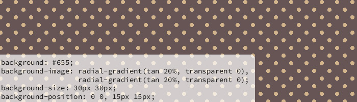
Using gradients to create geometric background patterns
This one had me whispering, “This is so cool!” to myself as I read through it. You can use gradients to create patterns like stripes, checkerboards, polka dots, and even more complex patterns like the ones found in the CSS3 Patterns Gallery. Lea emphasizes in the book that not all of these should be used, as the code can be pretty repetitive, so an SVG would make more sense in some cases.
However, the fact that one CAN build something like (my personal favourite) this Upholstery pattern by Nate Eagle, is pretty amazing.
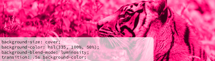
Colour tinting using blending modes
Seeing this trick made me want to go back and redo every project I’ve ever done and implement this method instead of using overlays.
I didn’t even know blending modes existed in CSS, but, lo and behold, they do!
In this example, you can see how Lea uses the luminosity blending mode to create a tinted image that is much brighter and richer than if you were to use an overlay or a filter. (Warning: The filter demo uses colours that fly by rather quickly on hover!)
You can adjust saturation without sacrificing quality using the blending modes option, which helps with making your image look like it’s supposed to have those colours. Overlays and filters look like overlays and filters; they have a flatter quality about them.
Using the luminosity blending mode keeps the lightness of your photo, but takes on the hue and saturation of the colour you choose. So when you add saturation, you’re not saturating your image, just the colour.
I had an absolute hoot experimenting with this one, and I hope you do, too!
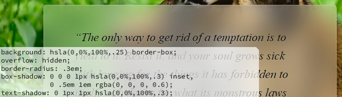
Using pseudo-elements and the blur filter to create a frosted glass effect
This effect is BEAUTIFUL. I’ve fiddled around so much with semi-transparent backgrounds, and most of the time I’ve gotten rid of them because I end up finding the effect a little bit tacky.
With this secret, you can turn your plain old semi-transparent background into a nice, blurred, frosted glass background.
Using pseudo-elements allows us to blur just the “glass” background of the text box rather than the entire box, text included. Combine that with some well-placed text-shadows and box-shadows, and you’ve got yourself something that looks like a fancy engraved plaque! I love it!
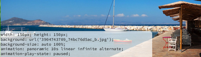
Smooth scrolling animation
This is a fun, interactive trick! Let’s say you have a limited amount of space to display a larger photo, like in this example. You can use keyframes to have the photo scroll smoothly across on hover.
By having the animation paused while the user isn’t hovering, it will stop where it is when the user moves the mouse away rather than jumping back to the start! When it reaches the end of the photo, there’s a little bounce and it scrolls back the other way.
I feel like there are endless ways to use this trick, and I love how simple it is while still being really entertaining!
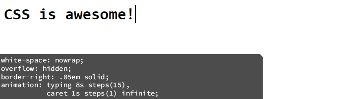
Typing animation using steps()
Using the steps() function in CSS animation, we can animate our text so that the characters appear one at a time, like this. You’ll need to know how many characters you have, which is easy enough with a short heading, but you can use a bit of JavaScript to determine that number if you have text that changes, for example.
You can even add a blinking cursor animation, which is essential to making it look more like typing!
This is such a cute little element to add to a website about coding, writing, or any other related themes you can think of!
I hope those CSS secrets blew your mind as much as they did mine! Of course, you can always buy the book for more detailed explanations of what exactly is going on under the hood when we use any of these examples and for many more secrets!